Data Exploration Case Study: Credit Default
Want to share your content on python-bloggers? click here.
Exploratory data analysis is the main task of a Data Scientist with as much as 60% of their time being devoted to this task. As such, the majority of their time is spent on something that is rather boring compared to building models.
This post will provide a simple example of how to analyze a dataset from the website called Kaggle. This dataset is looking at how is likely to default on their credit. The following steps will be conducted in this analysis.

- Load the libraries and dataset
- Deal with missing data
- Some descriptive stats
- Normality check
- Model development
This is not an exhaustive analysis but rather a simple one for demonstration purposes. The dataset is available here
Load Libraries and Data
Here are some packages we will need
import pandas as pd
import matplotlib.pyplot as plt
import seaborn as sns
from scipy.stats import norm
from sklearn import tree
from scipy import stats
from sklearn import metrics
You can load the data with the code below
df_train=pd.read_csv('/application_train.csv')You can examine what variables are available with the code below. This is not displayed here because it is rather long
df_train.columns
df_train.head()
Missing Data
I prefer to deal with missing data first because missing values can cause errors throughout the analysis if they are not dealt with immediately. The code below calculates the percentage of missing data in each column.
total=df_train.isnull().sum().sort_values(ascending=False)
percent=(df_train.isnull().sum()/df_train.isnull().count()).sort_values(ascending=False)
missing_data=pd.concat([total,percent],axis=1,keys=['Total','Percent'])
missing_data.head()

                           Total   Percent
COMMONAREA_MEDI           214865  0.698723
COMMONAREA_AVG            214865  0.698723
COMMONAREA_MODE           214865  0.698723
NONLIVINGAPARTMENTS_MODE  213514  0.694330
NONLIVINGAPARTMENTS_MEDI  213514  0.694330
Only the first five values are printed. You can see that some variables have a large amount of missing data. As such, they are probably worthless for inclusion in additional analysis. The code below removes all variables with any missing data.
pct_null = df_train.isnull().sum() / len(df_train)
missing_features = pct_null[pct_null > 0.0].index
df_train.drop(missing_features, axis=1, inplace=True)
You can use the .head() function if you want to see how many variables are left.
Data Description & Visualization
For demonstration purposes, we will print descriptive stats and make visualizations of a few of the variables that are remaining.
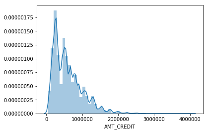
round(df_train['AMT_CREDIT'].describe())
Out[8]:
count     307511.0
mean      599026.0
std       402491.0
min        45000.0
25%       270000.0
50%       513531.0
75%       808650.0
max      4050000.0

sns.distplot(df_train['AMT_CREDIT']
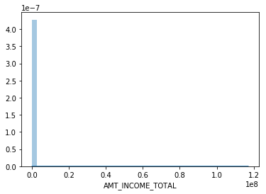
round(df_train['AMT_INCOME_TOTAL'].describe())
Out[10]:
count       307511.0
mean        168798.0
std         237123.0
min          25650.0
25%         112500.0
50%         147150.0
75%         202500.0
max      117000000.0
sns.distplot(df_train['AMT_INCOME_TOTAL']
I think you are getting the point. You can also look at categorical variables using the groupby() function.
We also need to address categorical variables in terms of creating dummy variables. This is so that we can develop a model in the future. Below is the code for dealing with all the categorical variables and converting them to dummy variable’s
df_train.groupby('NAME_CONTRACT_TYPE').count()
dummy=pd.get_dummies(df_train['NAME_CONTRACT_TYPE'])
df_train=pd.concat([df_train,dummy],axis=1)
df_train=df_train.drop(['NAME_CONTRACT_TYPE'],axis=1)

df_train.groupby('CODE_GENDER').count()
dummy=pd.get_dummies(df_train['CODE_GENDER'])
df_train=pd.concat([df_train,dummy],axis=1)
df_train=df_train.drop(['CODE_GENDER'],axis=1)

df_train.groupby('FLAG_OWN_CAR').count()
dummy=pd.get_dummies(df_train['FLAG_OWN_CAR'])
df_train=pd.concat([df_train,dummy],axis=1)
df_train=df_train.drop(['FLAG_OWN_CAR'],axis=1)

df_train.groupby('FLAG_OWN_REALTY').count()
dummy=pd.get_dummies(df_train['FLAG_OWN_REALTY'])
df_train=pd.concat([df_train,dummy],axis=1)
df_train=df_train.drop(['FLAG_OWN_REALTY'],axis=1)

df_train.groupby('NAME_INCOME_TYPE').count()
dummy=pd.get_dummies(df_train['NAME_INCOME_TYPE'])
df_train=pd.concat([df_train,dummy],axis=1)
df_train=df_train.drop(['NAME_INCOME_TYPE'],axis=1)

df_train.groupby('NAME_EDUCATION_TYPE').count()
dummy=pd.get_dummies(df_train['NAME_EDUCATION_TYPE'])
df_train=pd.concat([df_train,dummy],axis=1)
df_train=df_train.drop(['NAME_EDUCATION_TYPE'],axis=1)

df_train.groupby('NAME_FAMILY_STATUS').count()
dummy=pd.get_dummies(df_train['NAME_FAMILY_STATUS'])
df_train=pd.concat([df_train,dummy],axis=1)
df_train=df_train.drop(['NAME_FAMILY_STATUS'],axis=1)

df_train.groupby('NAME_HOUSING_TYPE').count()
dummy=pd.get_dummies(df_train['NAME_HOUSING_TYPE'])
df_train=pd.concat([df_train,dummy],axis=1)
df_train=df_train.drop(['NAME_HOUSING_TYPE'],axis=1)

df_train.groupby('ORGANIZATION_TYPE').count()
dummy=pd.get_dummies(df_train['ORGANIZATION_TYPE'])
df_train=pd.concat([df_train,dummy],axis=1)
df_train=df_train.drop(['ORGANIZATION_TYPE'],axis=1)
You have to be careful with this because now you have many variables that are not necessary. For every categorical variable you must remove at least one category in order for the model to work properly. Below we did this manually.
df_train=df_train.drop(['Revolving loans','F','XNA','N','Y','SK_ID_CURR,''Student','Emergency','Lower secondary','Civil marriage','Municipal apartment'],axis=1)
Below are some boxplots with the target variable and other variables in the dataset.
f,ax=plt.subplots(figsize=(8,6))
fig=sns.boxplot(x=df_train['TARGET'],y=df_train['AMT_INCOME_TOTAL'])
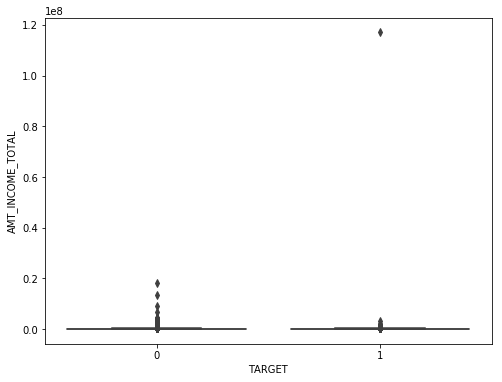
There is a clear outlier there. Below is another boxplot with a different variable
f,ax=plt.subplots(figsize=(8,6))
fig=sns.boxplot(x=df_train['TARGET'],y=df_train['CNT_CHILDREN'])
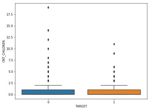
It appears several people have more than 10 children. This is probably a typo.
Below is a correlation matrix using a heatmap technique
corrmat=df_train.corr()
f,ax=plt.subplots(figsize=(12,9))
sns.heatmap(corrmat,vmax=.8,square=True)
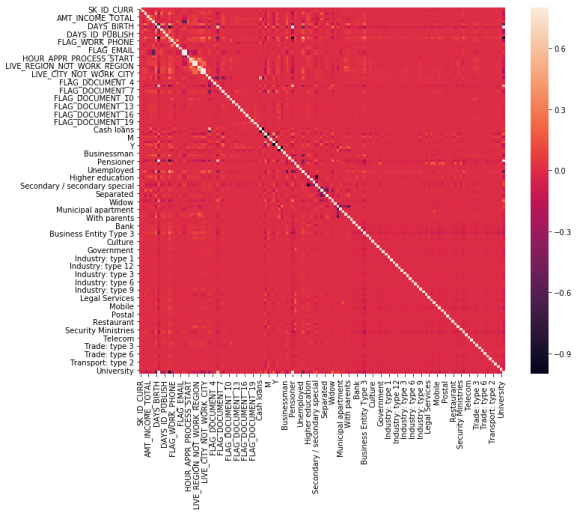
The heatmap is nice but it is hard to really appreciate what is happening. The code below will sort the correlations from least to strongest, so we can remove high correlations.
c = df_train.corr().abs()

s = c.unstack()
so = s.sort_values(kind="quicksort")
print(so.head())

FLAG_DOCUMENT_12 FLAG_MOBIL 0.000005
FLAG_MOBIL FLAG_DOCUMENT_12 0.000005
Unknown FLAG_MOBIL 0.000005
FLAG_MOBIL Unknown 0.000005
Cash loans FLAG_DOCUMENT_14 0.000005
The list is to long to show here but the following variables were removed for having a high correlation with other variables.
df_train=df_train.drop(['WEEKDAY_APPR_PROCESS_START','FLAG_EMP_PHONE','REG_CITY_NOT_WORK_CITY','REGION_RATING_CLIENT','REG_REGION_NOT_WORK_REGION'],axis=1)
Below we check a few variables for homoscedasticity, linearity, and normality using plots and histograms
sns.distplot(df_train['AMT_INCOME_TOTAL'],fit=norm)
fig=plt.figure()
res=stats.probplot(df_train['AMT_INCOME_TOTAL'],plot=plt)

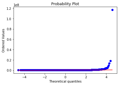
This is not normal
sns.distplot(df_train['AMT_CREDIT'],fit=norm)
fig=plt.figure()
res=stats.probplot(df_train['AMT_CREDIT'],plot=plt)


This is not normal either. We could do transformations, or we can make a non-linear model instead.
Model Development
Now comes the easy part. We will make a decision tree using only some variables to predict the target. In the code below we make are X and y dataset.
X=df_train[['Cash loans','DAYS_EMPLOYED','AMT_CREDIT','AMT_INCOME_TOTAL','CNT_CHILDREN','REGION_POPULATION_RELATIVE']]
y=df_train['TARGET']
The code below fits are model and makes the predictions
clf=tree.DecisionTreeClassifier(min_samples_split=20)
clf=clf.fit(X,y)
y_pred=clf.predict(X)
Below is the confusion matrix followed by the accuracy
print (pd.crosstab(y_pred,df_train['TARGET']))
TARGET       0      1
row_0
0       280873  18493
1         1813   6332
accuracy_score(y_pred,df_train['TARGET'])
Out[47]: 0.933966589813047
Lastly, we can look at the precision, recall, and f1 score
print(metrics.classification_report(y_pred,df_train['TARGET']))
              precision    recall  f1-score   support

           0       0.99      0.94      0.97    299366
           1       0.26      0.78      0.38      8145

   micro avg       0.93      0.93      0.93    307511
   macro avg       0.62      0.86      0.67    307511
weighted avg       0.97      0.93      0.95    307511
This model looks rather good in terms of accuracy of the training set. It actually impressive that we could use so few variables from such a large dataset and achieve such a high degree of accuracy.
Conclusion
Data exploration and analysis is the primary task of a data scientist. This post was just an example of how this can be approached. Of course, there are many other creative ways to do this but the simplistic nature of this analysis yielded strong results
Want to share your content on python-bloggers? click here.