Here are some quick wins for visualizing data with Python in Excel
Want to share your content on python-bloggers? click here.
In a previous post I explored some “quick wins” for wrangling and analyzing data in Python that would be otherwise difficult to do in Excel. That post largely avoided data visualization, so this post will be on a similar topic — visualizations that would be difficult to build in regular Excel but relatively straightforward in Python, particularly with the seaborn package.
Follow along with the starter file below:
Introducing the seaborn package
The following examples utilize the Seaborn package for generating visualizations. This package has already been imported into the default Python environment within Excel, using the alias (and Easter egg) sns:
Seaborn simplifies the process of data visualization by providing specialized functions for various types of visualizations. This enables users to effortlessly create and customize visuals by manipulating the function’s parameters. This approach streamlines the creation process, making complex plots accessible with just a few adjustments.
Connecting to the data and getting started
To get started visualizing in Python, use the =PY() function to enter Python mode. From there, convert the mpg table to a DataFrame called mpg like so:

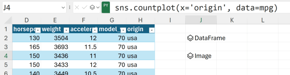
This post highlights less common data visualization types that could pose challenges within Excel. However, let’s begin with something more fundamental. We will start by generating a countplot to tally the observations within each origin category. To do this, insert a Python cell below your DataFrame output and input the following code:
Click on the Image result and select the image field to insert the plot into your worksheet:

The generated plot appears in the adjacent cell to your output. It’s likely that this cell is too small to view comfortably, necessitating an adjustment in the image placement. To accomplish this, right-click on the image and navigate to Picture in Cell > Place over Cells:

What I love about Seaborn is that by making a few adjustments to this relatively straightforward code, we can entirely transform the appearance of the plot. Can you observe the modifications I made to the countplot below?
- I switched the origin from the x-axis to the y-axis, creating a horizontal bar chart.
- I standardized the color of each bar to blue.
- I incorporated a title into the plot.

The final line of code, plt.title(), is derived from the matplotlib package, which is another widely used data visualization package. Its pyplot submodule is also preloaded in Excel.
seaborn harnesses certain fundamental features from this package, such as the capability to include plots and customize axis titles, among others. However, in this article, we will concentrate solely on the operations that can be directly accomplished using seaborn.
Pairplot
I like to think of a pairplot as like the visual version of a correlation matrix. The relationship between every pair in the dataset is represented as a scatterplot, which lets you check how linear the relationship is, whether it’s positive or negative, and so forth. Along the diagonals of the pairplot are histograms visualizing each variable’s distribution, which gives you a sense of its normality, whether there might be outlliers, and more.
To cut down on the amount of output this will return, I’ll select just a few variables be plotted with the vars parameter:

All of this output with just a single line of code! Imagine the effort it would have required to achieve the same outcome in Excel.
Let’s introduce a couple of adjustments to this plot: Firstly, I’ll segment the data by origin, allowing us to explore whether this breakdown can offer insights into any of the relationships within the data. Next, we’ll modify the histograms that appear along the diagonal of the pairplot. Instead of histograms, we’ll employ kernel density estimate (KDE) plots.
A KDE plot smooths the distribution of a variable and presents it as a continuous curve. This can simplify the process of recognizing the shape of the data distribution. Unlike histograms, which can be influenced by the choice of bin size and placement, KDEs provide a more consistent perspective on the underlying data pattern, devoid of the impact of arbitrary bin selections.

Between the larger code block and more detailed output, this section is hard to view on one screen. You can either recreate the plot to examine it yourself or download the solution file provided at the end of the post.
Pairplots can be overwhelming to analyze due to the abundance of output they produce. Nevertheless, they offer an unparalleled, all-in-one approach to comprehending the distributions within your dataset.
Kernel density estimate plot
Let’s proceed by constructing an independent KDE plot using the kdeplot() function. Initially, I’ll indicate which variable corresponds to each axis, followed by specifying the DataFrame from which this variable originates. Additionally, I will enable the shading of the area under the plot by setting the shade parameter to True:

Again, we can customize this plot by specifyuing additional parameters. For example, we can flip the axis by setting mpg to y, then break this down by origin again:

It should be noted that the KDE is normalized such that the area under the curve sums to 1 (or 100%). In this context, percentages on the X axis indicate the proportion of the data at a given mpg value relative to the entire dataset for that specific origin.
Violinplot
A violinplot is an extended version of a kernel density estimate (KDE) plot, showing both the KDE and interquartile range (IQR), which gives the plot its violin shape.
It also includes a box plot inside the violin, displaying the median, quartiles, and potential outliers. This plot is ideal for comparing continuous variable distributions across different categories or groups in a dataset, providing insights into shape, variation, and potential outliers. It simplifies visualization by replacing multiple KDE plots or box plots when dealing with multiple categories, but may be less suitable for very large datasets due to potential visual clutter.
Let’s create a violinplot to again compare the distribution of mpg across origin:
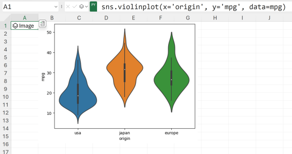
Again, there are plenty of options to cutomize this visual8ization. For example, I will change the color palette employed and change the boxplot inside the violin to drawn quartiles:

Stripplot
A stripplot is a categorical scatterplot that displays individual data points along an axis, often used to visualize raw data for discrete categories. Unlike KDE plots or violin plots, the stripplot directly plots each data point.
Let’s create one with the stripplot() function:

Adjusting the jitter and alpha parameters helps reveal more data points by spreading them out to reduce overlap and controlling their transparency for improved visualization clarity:

Swarmplot
Swarmplots share many qualities to stripplots, with some important differences. A swarmplot arranges individual data points in a compact, non-overlapping manner, preventing data points from obstructing each other, which forms an advantage to stripplots.
However, in denser datasets, swarmplots can become overcrowded, making it challenging to interpret the distribution. In such cases, stripplots might be preferred for their simplicity, while swarmplots are ideal for moderate-sized datasets with distinct categories.
It’s time to create one with the swarmplot() function:

To customize this one, we will change the color palette as well as reordering the categories on the x axis.

Small multiples
Lastly, let’s explore small multiples, achievable through seaborn’s FacetGrid() function. Small multiples offer a concise method of displaying data, generating a series of comparable graphs for different subsets. This approach simplifies comparison and aids in recognizing patterns across categories, facilitating swift insights into data trends and variations.
Constructing small multiples in seaborn is significantly more straightforward than in basic Excel, though they still require slightly more effort to set up than the plots discussed thus far.
The initial step towards creating a small multiple involves crafting a FacetGrid() object. Specify the data source and designate which variable to “facet,” or arrange, across the rows or columns of the plot. In this instance, we’ll position the origin variable along the columns:

Let’s proceed by mapping data onto this setup. Position the model_year variable along the x axis and mpg on the y.

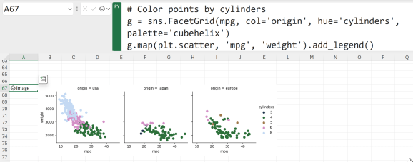
Taking a more focused approach, we could delve even deeper by constructing small multiples. This time, position origin along the columns and cylinders along the rows:

In this case, where data within each facet is becoming quite sparse, it might be more effective to represent cylinders within the row facet rather than separating them into distinct columns. This can be achieved by assigning different colors to each cylinder value:
The flexible world of seaborn
As demonstrated by these examples, seaborn provides a wide array of plot types that were previously challenging to create within Excel. Nevertheless, embedded seaborn plots lack some of the interactive functionalities familiar to Excel users.
Native Excel plots are more interactive due to their seamless integration with Excel’s interface and features, enabling easy manipulation and customization using built-in tools. In contrast, embedded seaborn plots in Excel workbooks rely on static image rendering and may offer fewer interactive options directly within Excel.
However, this is a nascent feature, and enhanced interactivity for these plot types is likely on the horizon. Notably, Mynda Treacy at MyOnlineTrainingHub has already devised methods to link Excel sliders with Python plots, hinting at a promising future for interactive seaborn visualizations.
Which plot type intrigued you the most and why? How might you apply them in your work? Do you have any questions about data visualization with Python in Excel or using Python in Excel more broadly? Feel free to share your thoughts in the comments.
The post Here are some quick wins for visualizing data with Python in Excel first appeared on Stringfest Analytics.
Want to share your content on python-bloggers? click here.