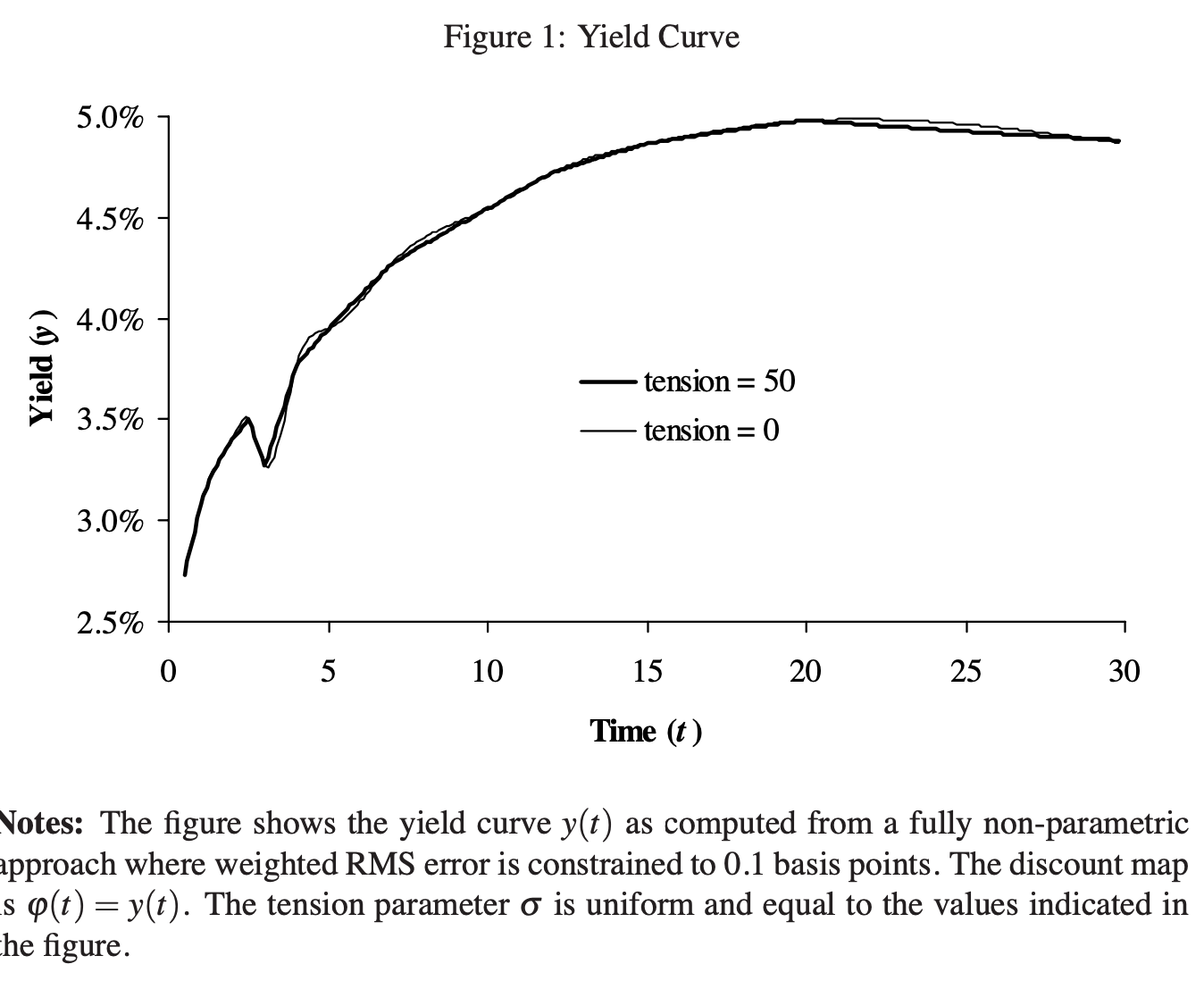
Streamlining Process Efficiency With a Pareto Chart

December 6, 2023 | erika

In our data-centric world, tools that visualize data effectively are of paramount significance. One such tool is the Pareto chart. In the following sections, we will explore the concept, importance, and utilization of Pareto charts in enhancing efficiency. Below, you can learn more about Pareto charts and their significance in ...
[...Read more...]

The Impact of Funnel Charts on Sales Data Visualization

December 3, 2023 | erika

In a fast-paced commercial world driven by data, effective data visualization tools have become indispensable assets. The ability to succinctly visualize large volumes of complex data enhances decision-making processes at all levels of a business. In this article, we will focus on one specific data visualization tool that is positively ...
[...Read more...]

How to get the most of Python in Excel with the Anaconda Toolbox

November 30, 2023 | George Mount

The recent incorporation of Python into Excel marks a substantial leap in data analytics, combining Python’s powerful features with the accessible Excel workbook interface. Employing Python directly within Excel’s formula bar is noteworthy, yet add-ins further enrich this capability. This enhancement is particularly important considering that Python programming ...
[...Read more...]

How to resize Python plots in Excel

November 30, 2023 | George Mount

I’m not sure about your experience, but personally find Excel’s charting features antiquated at times. They can be quite finicky to use, particularly when it comes to customization. Iterating between various plots and executing tasks like combining different plot types or coloring by group proves to be challenging. ...
[...Read more...]
1 5 6 7 8 9 98