Here are some quick wins for using Python in Excel
Want to share your content on python-bloggers? click here.
As a long-time Python enthusiast who has frequently recommended Excel users delve into Python (and even authored a book on the subject), a prevalent question I encountered from hesitant Excel users is:
What can I achieve in Python that I can’t in Excel?
With the recent integration of Python into Excel, much of the skepticism around learning Python has dissipated. After all, why would Microsoft integrate Python into Excel if there wasn’t a compelling reason?
Nevertheless, those considering Python in Excel might still wonder about its distinct advantages. In this post, I will highlight several “quick wins” — data wrangling and analysis tasks that I find more straightforward in Python.
Getting started
The Python code examples in this post shuld be fairly intuitive to anyone with intermediate Excel skills, such as familiarity with lookup functions and PivotTables. However, when delving deeper into Python for Excel, I highly recommend adopting a structured approach to learn the language from the ground up, independent of Excel’s context.
If you’re seeking a book tailored to the needs and experiences of Python users, check out my book, Advancing into Analytics: From Excel to Python and R.
At the time of this writing, Python integration in Excel is available as a preview feature within the Microsoft 365 Insider Program. To learn more about how to join the program and access this feature, click here.
Additionally, you can download the accompanying workbook to follow the demos in this post:
Creating a pandas DataFrame in Excel
The first step to using Python in Excel is to transform an existing data source, such as an Excel table, into a Python object. To access the Python editor, enter =PY() into the Formula Bar or use the keyboard shortcut CTRL + ALT + SHIFT + P. Once you do, a green PY indicator will appear on the left side of the formula bar, signifying that you are in Python mode.
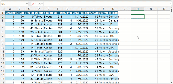
From this point, create a DataFrame named sales by assigning it to the entire sales table, including its headers, in Excel. You can achieve this using the xl() function.
The cell in M10 confirms that this is a DataFrame. Well done! Now, what’s the next step?
Interestingly, this is a linked data type. By clicking on it, you can view values related to this property. For instance, we can get a preview of the data:

While merely viewing a preview of your original data in Python might not be particularly thrilling, there are several straightforward yet effective ways to analyze the data. Let’s explore some of these methods.
Data profiling
First, let’s delve into commands that provide a fundamental understanding of our data. For instance, we might be interested in determining the number of rows and columns present or viewing a few rows to familiarize ourselves with the data’s structure.
Sampling rows
One of the most frequently used methods in Pandas is the head() function. Keep in mind that a typical DataFrame can encompass hundreds of thousands of rows or even more. Hence, printing them all isn’t practical. The head() method offers a concise glimpse into the data, giving you a clear sense of its content.

Similarly, get the last few rows with tail():

If you’d rather just get a random sample of rows throughout the dataset, you can use the sample() method. Place the desired number of records inside the parentheses:

While basic Excel can tally the number of empty cells in a specified range, tools like Pandas and Power Query offer a more comprehensive method to address genuine null or absent values.
For instance, the process described below calculates the percentage of missing values in each column. Here’s what happens step-by-step:
isna()marks each record as either missing or present.sum()totals up the instances marked asTruebyisna().- Dividing by 100 then converts these counts into percentages.

We could even sort the results from high to low through the power of method chaining:

Retrieving the dimensions
One more of many quick, easy ways to profile your data in Pandas: using the shape attribute to retrive the number of rows and columns of your DataFrame.

Exploratory data analysis
Now that we have a foundational understanding of our dataset, including its dimensions and the extent of its missing values, it’s natural to pivot towards descriptive statistics and exploratory data analysis (EDA). It’s essential to note that a thorough EDA often incorporates data visualization. Python boasts some plots for EDA that, although challenging to replicate in Excel, are straightforward to build. However, I’ll save an introduction to Python data visualization for another post.
Although tools like the Data Analysis ToolPak in Excel can produce many of the outputs we’re discussing, Python offers a more fluid experience. In Python, you can easily iterate and expand upon your findings since all your analyses are preserved as objects.
Although tools like the Data Analysis ToolPak in Excel can produce many of the outputs we’re discussing, Python offers a more fluid experience. In Python, you can easily iterate and expand upon your findings since all your analyses are preserved as objects.
Descriptive statistics
Use the describe() method to return some basic summary statistics for your DataFrame:

describe() offers lots of options for customization. For example, rather than printing the quartile values for each variable we can find the 10th, 50th, and 90th percentiles:

Those with a keen eye may observe that these results don’t encompass all the variables in the table. The columns containing textual data are omitted. This is because many of the descriptive statistics don’t apply to qualitative variables. For instance, determining an “average country” is nonsensical.
However, if we wish to extract basic summary statistics for our non-numeric columns, we can utilize describe() with the parameter exclude='number'.

Correlation matrix
Similarly, we can quickly derive a correlation coefficient of all relevant variables in your DataFame with corr():

One area where Python clearly outshines Excel in correlation analysis is its capacity to swiftly represent correlations as a heatmap. Let’s achieve this using the heatmap() function from Seaborn:

If you’re unfamiliar, seaborn is a popular data visualization package in Python. You’re likely to encounter and utilize this package frequently — just not further in this post.
Time series
Working with dates and times in Excel can be, shall we say, not pleasant, and sometimes . By contrast, the pandas package in part is named for “panel data,” or a type of time series. TL, DR? It’s really good at working with dates.
Handling dates and times in Excel can be, to put it mildly, less than enjoyable, and at times even problematic. In contrast, the pandas package in Python derives part of its name from “panel data,” which refers to a kind of time series data. In short? Pandas excels at date handling.
Setting the Index
However, to fully harness pandas’ capabilities with dates, a bit of setup is necessary: the Index of your DataFrame should be set to the pertinent date column.
Let’s proceed with this setup, generating a new DataFrame named sales_ts. (Avoid using inplace=True or saving the DataFrame back under the original name. These will not work properly in the Excel environment, for whatever reason.)

You will see in the previous output that the order_date column is now designated as the Index of this DataFrame.
Resampling
When dealing with time series data, there’s often a need to summarize it at different levels of granularity. As it stands, the data captures every sale for each day, making it challenging to discern overarching sales patterns or trends. Maybe you’re interested in consolidating the data to observe it on a monthly or yearly basis.
While Excel PivotTables make date aggregation fairly straightforward, the experience isn’t always the most fluid or adaptable. I find the resample() method to be considerably more potent, even if there’s a slight learning curve.
For instance, the following will compute the total quantity on a weekly basis:

The basic syntax—defining which period to resample by, how to aggregate the results, and which column to aggregate—can be employed in a myriad of combinations.
For instance, let’s determine the weekly sales next. Since there isn’t a sales column currently in the dataset, we’ll need to derive it. This involves using a column notation reminiscent of tables in Excel.
Once we have that column, we can ascertain monthly sales by passing ‘M’ to the resample method and then applying sum(). I’ll also store the results in this DataFrame, as I plan to utilize it in the following steps.

Leading and lagging variables
In many time series analyses, key variables are shifted up or down by a specified number of periods to account for them being either leading or lagging indicators. The shift() method simplifies this task: using negative numbers inside shift() moves values backward, creating leading indicators, while positive numbers produce lagging indicators.
Before introducing these variables, I’ll transform monthly_sales from a Series to a DataFrame, enabling it to accommodate multiple columns:

You’ll notice that the final value of the leading variable and the first value of the lagging variable are now missing.
Moving and cumulative averages
Finally, we can also create a cumulative average or sum by chaining the desired aggregation type to expanding():

Using similar techniques, you can also create rolling averages in Pandas. However, I’ll leave that experimentation up to you. You might consider using the completed exercise file as a starting point
Conclusion: Python one-liners
I hope this curated list of Python examples for Excel not only convinces you of Python’s value as an addition to your toolkit but also shows that it’s not inherently difficult to master. In fact, every example in this post is just one line long. Chances are, you’ve crafted more intricate Excel formulas or VBA modules.
Which of these use cases inspires you to incorporate Python into your workflow? Have you discovered other beneficial applications? Do you have any questions about using Python with Excel? Share your thoughts in the comments.
The post Here are some quick wins for using Python in Excel first appeared on Stringfest Analytics.
Want to share your content on python-bloggers? click here.